The Problem: Designing for Two Opposing Physical Realities
Most consumer mobility apps optimize for a single dominant physical context: a pedestrian standing on a sidewalk looking down at a handheld phone. Hopr Carpool, however, operates across two wildly divergent physical environments simultaneously:
- The Driver in Motion: The driver's device is mounted on an air vent or windshield bracket 65–85 centimeters away from their eyes. They are navigating dense, unpredictable Bangalore traffic, subject to severe sunlight washouts, sudden vehicle movements, and cognitive overload. Interactions must be executed in sub-second glances with massive touch targets.
- The Rider on Foot: The rider is navigating bustling corporate campus gates or curbside service lanes, often juggling backpacks, rain umbrellas, or laptop bags while trying to locate an approaching private white-plate vehicle among hundreds.
Existing internal design libraries borrowed from on-demand two-wheeler delivery services were fundamentally unsuitable. We needed a unified, high-contrast, ergonomics-first design system tailored from the ground up for dual-sided carpool commutes.
Token Architecture: Scaled for Velocity and Glare
We established a hierarchical design token pipeline bridging Figma tokens directly to React Native and Web codebases via automated CI export routines.
1. Spatial & Density Modes
Rather than hardcoding padding or fixed pixel bounds, the design system defines two dynamic spatial contexts:
- Stationary Density: Standard 8pt grid spacing with dense information cards for pre-commute planning and evening route browsing.
- Drive Mode Density: Automatically activated when vehicle velocity exceeds 15 km/h. Touch targets expand to a strict minimum of 52x52 points, secondary typographic metadata dims, and primary actions occupy full-width bottom trays with tactile haptic boundaries.
2. High-Contrast Chromatic Semantics
Under direct tropical sunlight through car windshields, subtle pastel greys and muted tints wash out completely. We re-engineered the color palette around high-delta luminance steps:
- Route Primary: Deep emerald emerald hues with high chromatic punch (
#005224 on #85FFB3 badges) ensuring status readability in high-glare environments. - Safety Critical: High-saturation cadmium amber and warning crimson calibrated to pierce ambient reflections without triggering unwarranted panic.
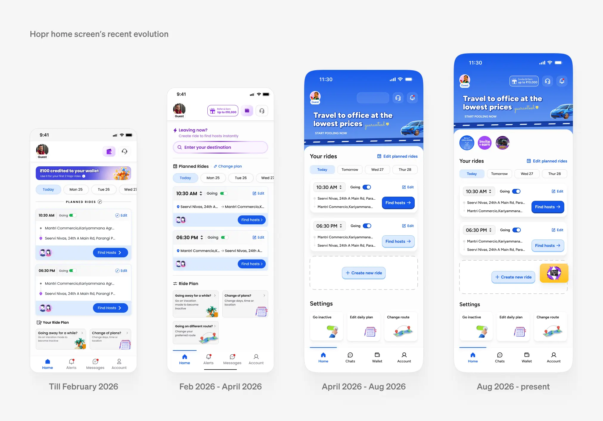
Evolution of Hopr's design tokens and component hierarchy from early wireframes to production drive modeThe Core Component Ecosystem
We synthesized dozens of fragmented screens into a coherent set of reusable compound components:
The Rendezvous Card Tree
A unified spatial navigation unit that communicates the complete trip narrative: pickup waypoint, walking handshake distance, mutual coworkers onboard, and detour impact in a single glanceable unit.
Dual-State Status Badges
Status chips that pair distinct geometric glyphs with text labels so that color-blind commuters and drivers in high-vibration conditions never confuse a "Confirmed Match" with a "Pending Route Request."
Key Design Decisions & Trade-offs
Bifurcated Typography Scale vs. Single Responsive Scale
ShippedRationale: Prevented catastrophic driver distraction while keeping pre-trip browsing rich
We evaluated using a single responsive font scale with fluid clamp formulas. In testing, this failed: drivers needed oversized tabular figures for time-to-pickup, while riders required dense metadata to verify co-rider profiles. We shipped two distinct type tokens: display-drive and body-editorial.
Skeuomorphic Speedometer & Fuel Gauges
GraveyardRationale: Created cognitive clutter without actionable value
Early explorations incorporated analog fuel gauge graphics to explain route detour costs. User research revealed that drivers found the graphics gimmicky and distracting. We replaced them with clean typographic impact badges: '+3 min / +₹45'.
“A design system for mobility isn't just about pretty buttons or uniform border radii. It's a safety system that keeps drivers' eyes on the road and gives riders confidence on chaotic streets.”
Production Adoption & Long-Term Impact
Within four months of rollout, 100% of consumer-facing screens across iOS and Android were migrated to Hopr's Design System. Design handoff friction dropped to near zero, and pull-request UI reviews were cut by half through automated linting of shared system tokens.